Crafting Easing Curves for User Interfaces
Since the introduction of flat design, the quality of animation has never been more essential for creating great interfaces. Through motion design, one can influence the overall brand experience of a product and set it apart from the market. Animation can make complex interactions simple and turn good designs into memorable user experiences. But how does one create quality animation? Easing curves are one of the many core components that takes a decent animation and makes it fantastic!
The problem is that understanding how easing curves work can be a bit confusing. I hope to clear that up through this post, which stems from the interest in timing functions my previous article After Effects to CSS. People wanted a better understanding about how easing curves work and how to design your own.
An easing curve is a line that defines the acceleration pattern on a graph. Easing curves are commonly referred by many other names such as Motion Curves, Timing Functions, Bezier Curves or just Curves. The different shapes of an easing curves also have keywords like ease in, ease out, or ease in out.
How Easing Curves Work
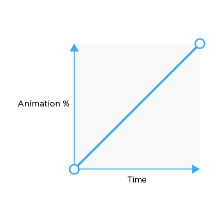
Easing curves are created via an X,Y axis. The meanings of the X and the Y can vary from application to application. Within development, the meaning of the X and the Y states stays pretty consistent. Which is defined as Percent of Animation(Y) over Time(X).
What does that this easing curve look like when put into practice? That’s where the concepts of timing and spacing come into play.
Timing and Spacing
Timing is the duration for an animation to finish. Spacing is the space between each “frame” but in our case it is the space between the each percent of animation. Below I have showcased how this spacing relates to an easing curve. Think of vertical = fast and horizontal = slow.
Linear Ease Spacing
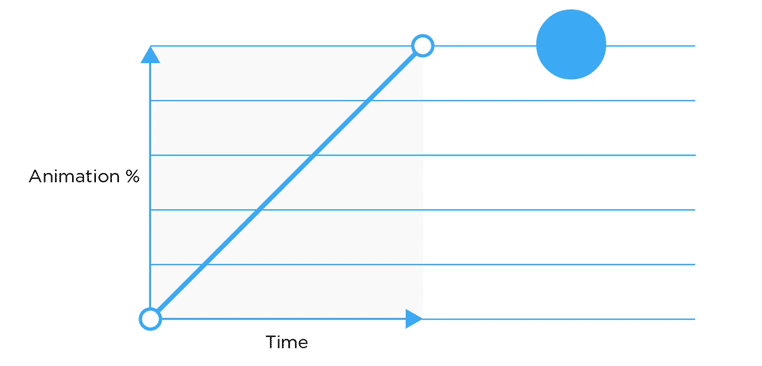 Within linear easing the spacing of the dot travels is equidistant across the length of the animation.View on CodePen
Ease In Spacing
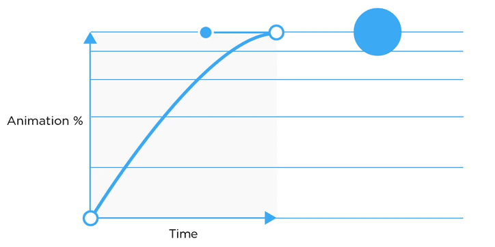
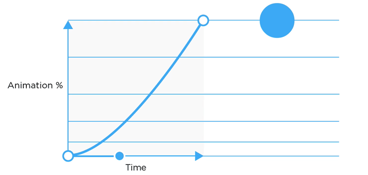 Within ease in the spacing of the dot is more condensed in the beginning and expands as the animation continues, giving the illusion of starting slow and speeding up.View on CodePen
Ease Out Spacing
 Within ease out the spacing of the dot starts large and condenses in the end, giving the illusion of starting fast and slowing down.View on CodePen
Designing an Easing Curve
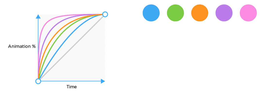
Designing an Easing Curve People always ask me, “What easing curve do I use and when?” My answer — it really depends on the scenario. There is not one easing curve that work for absolutely everything. Crafting these curves is a key component of designing motion. Easing curves are commonly designed after physics within the real world but don’t always follow those rules. The real world is a great place to gain inspiration for animation. For example, no object in the real world starts at full velocity and immediately stops — like a linear easing curve does. Objects always have some kind of acceleration or deceleration.This is just one of the many concepts Disney has outlined in the 12 principles of animation, which is largely based on physics and the exaggeration of physics.
When crafting an easing curve keep in mind that vertical is fast and horizontal is slow. The curve you create should be dependent on the interaction your designing. You can create many different types of curves within the (X,Y) grid.
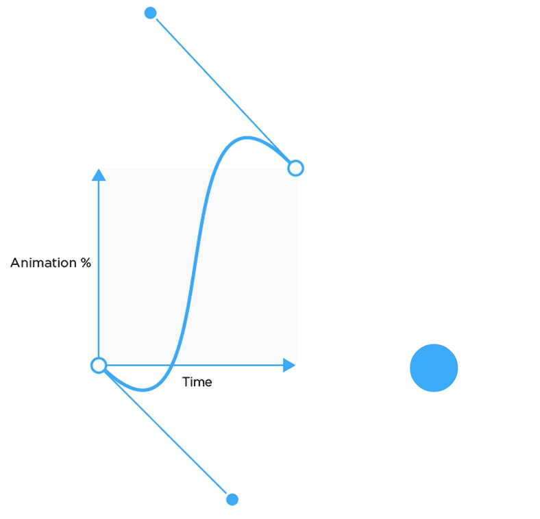
In addition crafting curves within the frame, one can break the frame! Breaking the frame will cause the animation to go outside of the values in between the keyframes. Breaking the frame can create bounce or anticipation effects.
There are many tools for creating cubic bezier’s here are a few:
Easing Curves within Development
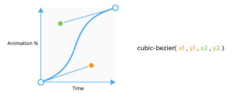
Easing curves within development are called “Timing Functions” which are mathematical equations that create a bezier curve that defines the acceleration pattern on a graph. The function that is commonly used within development is the cubic-bezier. That is what I will be going over in this post.
Within most programming languages, there are some predefined easing curves like ease-in, ease-out, and ease-in-out. Be sure to check the documentation to see which curves are predefined. Below I listed the easing curves that are predefined within CSS.
ease-in = cubic-bezier(.42, 0, 1, 1)
ease-out = cubic-bezier(0, 0, .58, 1)
ease-in-out = cubic-bezier(.42, 0, .58, 1)
Defining Easing Curves in CSS
Global
In CSS there is the “global” ease that can be defined in the object class, this applies the same ease to every keyframe. For example, if you have a bounce, the animation will bounce at every keyframe.

.object-class {
 animation-name: animation-rocks;
 animation-timing-function: cubic-bezier(1,.01,.91,.46);
}
Per Keyframe
You can get more precise with eases by defining them within keyframes. It is important to keep in mind that the easing curve is defined in the percentage value before you want the ease to happen.

@keyframes animation-name {
  0% {
    animation-timing-function: cubic-bezier(1,.01,.91,.46);
  }
  25% {
    animation-timing-function: linear;
  }
  50% {
    animation-timing-function: cubic-bezier(0,.02,0,1.01);
  }
  75% {
    animation-timing-function: linear;
  }
  100% {
    animation-timing-function: linear;
  }
}
Curved Delays
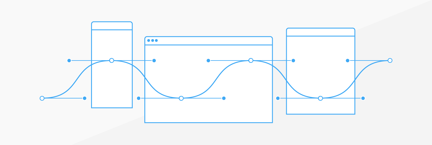
The concept of easing curves doesn’t just apply to a single animation but can applied to delays! Which can be really fun when there are many elements on the screen animating. Here is an example of a Sine wave delay. I created this by created a Sass loop and using Compass math helpers to calculate Sine.
Thanks for reading! If you want any resources or have questions feel free to tweet me @ryan_brownhill