Motion Design : Beyond the Screen

When people hear the term “Motion Design,” they usually equate it with “Motion Graphics Design,” which Wikipedia defines as “_a subset of graphic design that uses graphic design principles in a filmmaking or video production context through the use of animation or filmic techniques”. _This definition is very specific and confines the medium of motion to graphic design and film production. Motion Design, rather, is a broader context that includes the design of any object or system that changes over time. It includes different design types such as industrial design, user experience design, and even service design.
This post will dig into the broader context of motion, and break it down into how motion is used in interaction design across many forms of media.
The Medium
Motion Design occurs everywhere and through all sorts of media. A medium by definition is a particular form or system of communication. Examples include the software and apps we interact with, the physical products that we use, and the services we experience. In order to understand motion in context, let’s look at an implementation of each of these media.
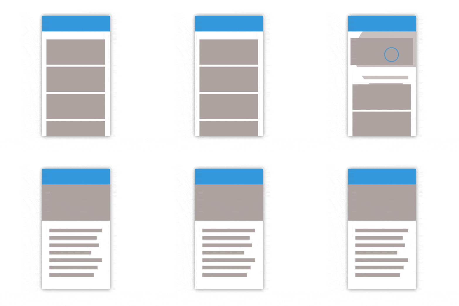
Let’s start with the screen. The screen is a medium of the digital age from televisions, to car dashboards. The screen itself for the most part doesn’t move, but the information presented on the screen does, in order to interact the state of the screen changes. Within software, motion is created through animation on a screen, the successive images that create the illusion of motion. As you can see above, software utilizes animation to create seamless transitions between states.
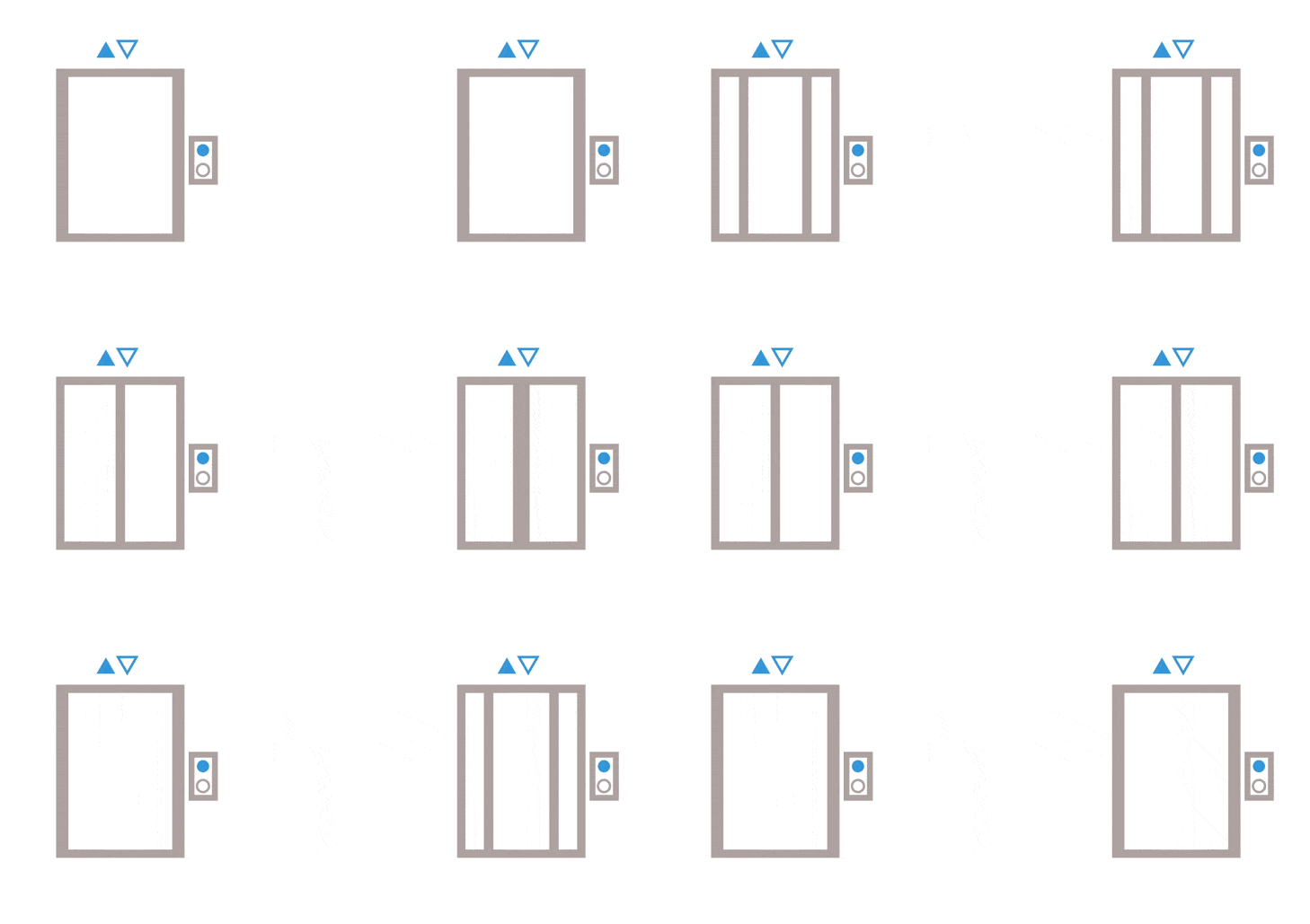
In the physical product realm, movement is seen through changing components. For example, the user experiences variety, movement, and timing through the opening and closing of the elevator doors. (see above)

Another example of motion within the product realm is the oscillation of a fan. Meaning is being conveyed through the fluidity of motion. (see above)
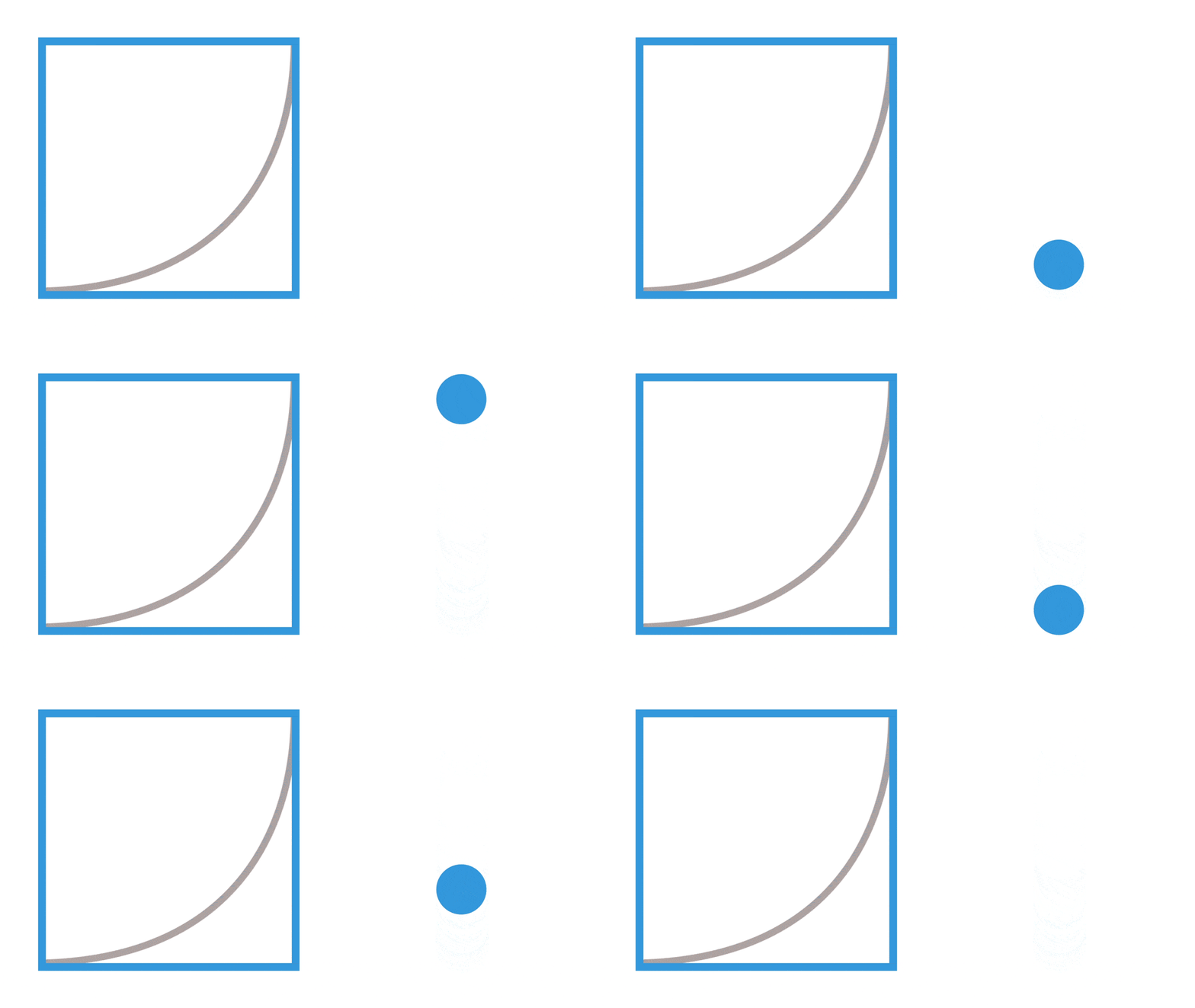
Check out more easing functions at: http://easings.net/
Motion Design can also be applied to any service experience. For example, every service is experienced within an amount of time, and that time can be mapped as a user journey. Each journey has a specific motion curve that can be illustrated alongside a journey. In relation to the company Über (see below), the journey can be seen as an “ease out curve,” (see above) starting slow and speeding up at the end.
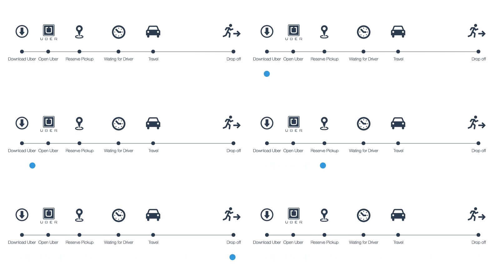
An Über customer begins by downloading or opening the app, reserving a pickup, and waiting for the driver to arrive. Once they get into the car, the experience speeds up until the customer arrives and exits the car, with the experience suddenly coming to an end. By applying Motion Design to services, the service creator can better understand their users’ full experience and better tailor that experience.
In the future, as new media is developed, Motion Design’s application can provide a sense of purposeful timing throughout the entire user experience.
The Message
In each of these different media, motion can be utilized to communicate a message. A message by definition is communication containing some information, news, advice, request, or the like, sent by messenger, telephone, email, or other means. However, a message is not only about the information itself, but how it is communicated.
The Path of Functional Aesthetics
Through timing and path the message being conveyed can lean toward the two different sides of the spectrum. Either the timing and path can be weighed heavily on function: only providing what is needed — like a blunt note. In contrast, the timing and path can also weigh heavily on the aesthetic side: where there is a lot of fluff around the message to make it pleasant. Ideally the message will have the perfect balance of function and aesthetics. See Examples Below.
Function > Aesthetics
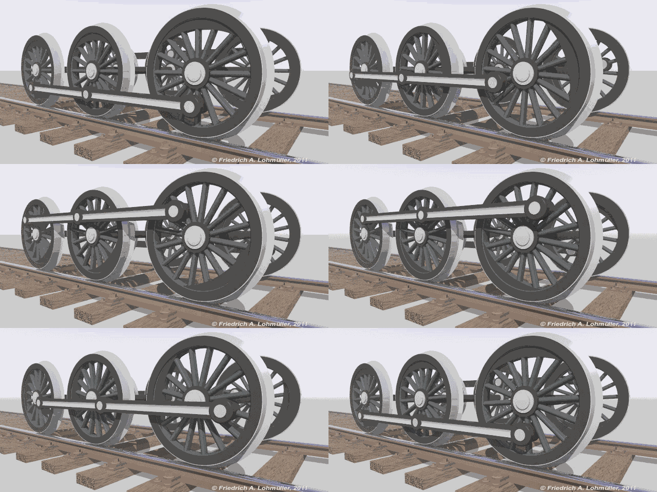
Source: http://www.f-lohmueller.de/pov_anim/ani_6006d.htm
The path of the train wheel above is illustrating movement that is heavily weighted on functionality. Although, this craftsmanship can be perceived as a piece of beauty.
Aesthetics > Function
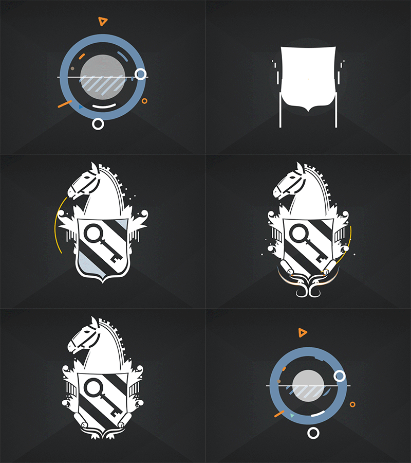
Source: https://dribbble.com/shots/1516118-Coat-of-Arms-Logo?list=users&offset=12
The path for the graphic above is illustrating movement that is heavily weighted on aesthetics. Although some elements maintain functionality, most elements remain frivolous and unnecessary.
Function = Aesthetics

Source: https://dribbble.com/shots/945409-Login-Animation?list=users&offset=21
Above is a good example of functional aesthetics. The interface above provides feedback when a user enters their password wrong, the clock wiggles. This is the interface telling you “No, no, What is this?”. It is equivalent to the human expression of shaking your head when you don’t agree with something. This is a good example of the function of animations for direct communication, while painting aesthetically pleasing movement.
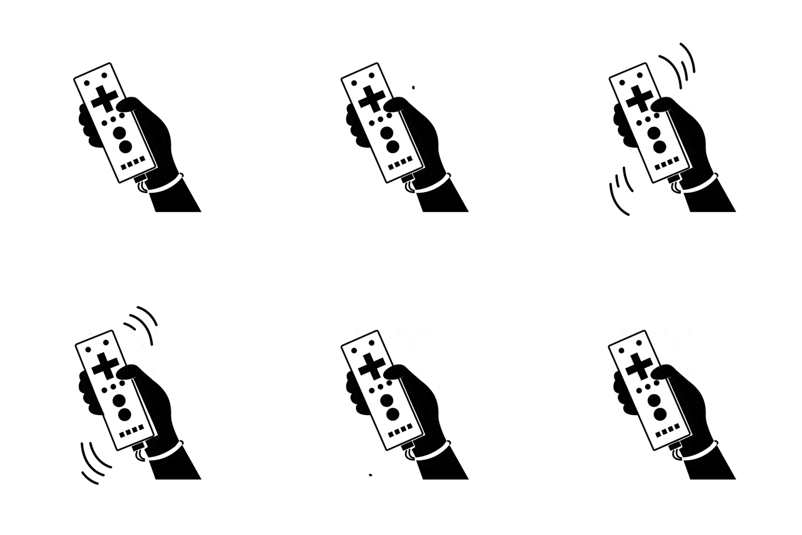
Source: http://thenounproject.com/
The Wii remote is another good example of functional aesthetics. The remote vibrates if the user does something incorrectly within the interface. This vibration signals a message and is presented to the user through a functional and pleasing path.
Motion design thinking can be applied beyond the screen to different media from services to products. The message is about balancing function and aesthetic. By utilizing this as a building block for design, designers will begin thinking about how to improve future interactions across the board. Now that I have shared fundamental thinking of motion design, I will continue to develop this concept and show how to design motion for experiences.